BRANDING AND LOGO DESIGN
Branding design creates a visual identity through logos, colors, and typography to establish a cohesive and recognizable presence, building trust and connecting with the audience.
SALOOP GAMING
- Branding Design
Saloop Gaming, a division of Saloop News, specializes in dynamic media solutions tailored for the Gaming and IT sectors. Saloop Gaming expertise encompasses news publishing, marketing, localization, and video creation with cutting-edge content and strategies that resonate in Thai, Japanese, and English languages to ensuring message connects effectively with diverse audiences.
426 WORKS
- Branding Design
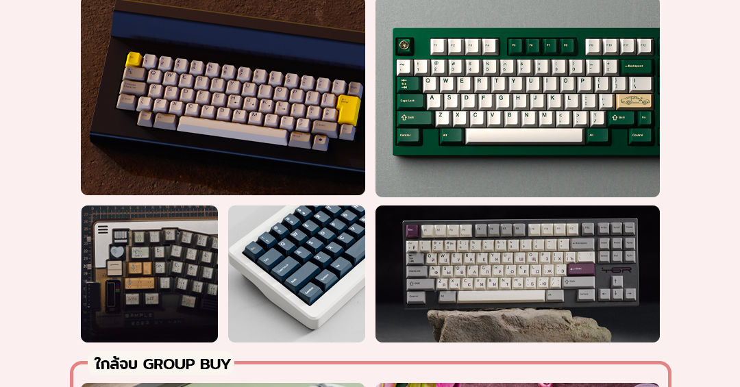
426 Works is dedicated to elevating the typing experience with custom mechanical keyboards that combine performance, style, and precision. The name "426" is a subtle nod to the HTTP 426 error (Upgrade Required), reflecting a commitment to continuous improvement and innovation in keyboard design.
More than just a keyboard store, 426 Works brings together craftsmanship and customization, offering high-quality products for both enthusiasts and professionals. With a focus on expert design, premium materials, and a seamless user experience, it ensures that every upgrade feels like a true enhancement.
929 WEARS
- Logo Design
929 Wears is a high-tech streetwear brand that merges innovation with urban survivalism. Designed for those who live at the intersection of technology and style, the brand creates versatile, functionally advanced apparel. The name “929” is pronounced Kao-Song-Kao in Thai, meaning “Step-Two-Step,” symbolizing progress and forward movement. The logo’s edge cuts and fragmented numbers reflect a blend of modern tech and nostalgic design, embodying the brand’s balance of past and future.
POLARIX SOLUTION PROJECT
- Logo Design
Polarix Solution is an IT consulting and in-house development company dedicated to delivering precision-driven solutions. The name Polarix is derived from Polaris (the North Star), a timeless symbol of guidance, stability, and leadership.
The "X" in the name represents a target, emphasizing precision, goal achievement, and a tech-driven approach. The logo, composed of three intersecting strips forming a star, visually embodies direction, connectivity, and technology reflecting the guiding role of Polaris in navigation and strategy.
Designed with a geometric and structured aesthetic, the logo presents a modern and professional identity, crucial for an IT consulting firm. The cool blue color tone reinforces the brand’s commitment to trust, intelligence, and precision, making it an ideal fit for the tech industry.
OTHERS LOGOS
- Currently updating
- Currently updating
OVERHEAT GAMING
- Branding Design
Overheat Gaming is a division of Overheat Group, focusing on gaming news, updates, and hardware/software reviews across a website, YouTube, and social media. Targeting an audience in their 20s and 30s, the logo features a pixelated design that reflects gaming culture, with the name "Overheat" represented by fire pixelation, symbolizing energy, passion, and the dynamic nature of the gaming world.
OVERHEAT GROUP
- Branding Design
Overheat Group is a company that sits at the crossroads of event organizing, news media, and esports in the gaming industry. While gaming is at its core, the logo is designed to be simple and memorable, ensuring the company name sticks with its audience. The text-based logo was chosen for clarity, with the “E” stylized as three bars to symbolize the three pillars of the business: event organizing, media, and esports. The color scheme is primarily dark purple, evoking luxury, power, and ambition qualities that align with the professional and high-impact nature of the gaming industry.


